Visualization basics#
AlphaGenome predicts a variety of output types with different data shapes and
biological interpretations (table). We provide
alphagenome.visualization to generate
matplotlib figures from model API outputs, which we outline here.
Tip
See the visualizing predictions tutorial for worked examples of plotting different modalities.
Plot#
The key function, plot(), takes
as input a list of components and returns a matplotlib.figure.Figure.
Components#
A component is a light wrapper around a model output (such as predicted genomic tracks, splice junctions, etc) and specifies plot aesthetics. Each component maps to one vertically stacked subplot in the final figure (see blue text in the figure). Each component has an independent y-axis but shares a common x-axis, corresponding to the length of the DNA interval, in base pairs (bp).
Several default components are available, each designed to best visually represent different modalities and data shapes returned by the model API (see table).
Annotations#
Additional figure elements specific to the DNA interval, but outside of
components – such as locations of promoters or variants – can be overlaid via
a list of annotations that are passed to
plot().
Custom plotting#
For users interested in configuring novel components, extend the
AbstractComponent() and
AbstractAnnotation() base
classes.
Any other data supplied by the user can be visualized using this library as is,
as long as it is provided to
plot_components in the format
required e.g. TrackData for
Tracks.
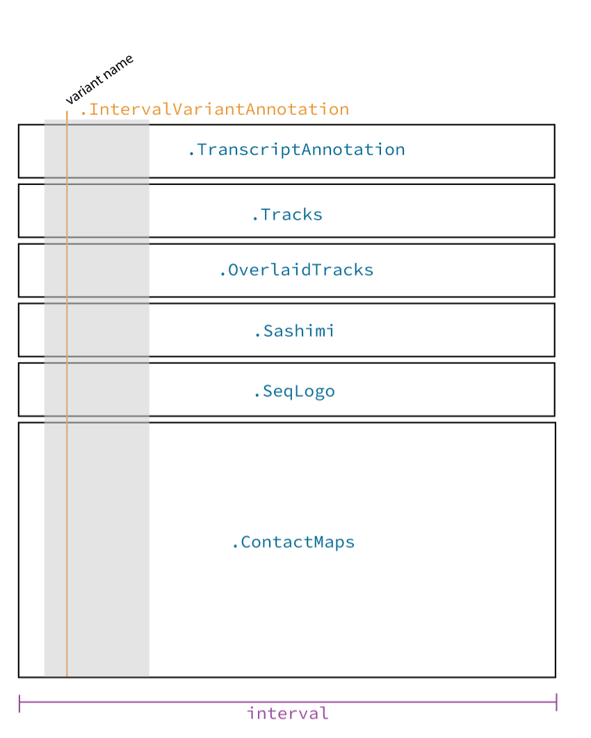
Illustrative diagram of visualization library. Blue text indicates
plot_components classes, and purple text indicates arguments to
plot_components that adjust figure-wide aesthetics#
Component name plot_components.* |
Description |
Example figure |
Data shape supported |
Recommended model outputs |
Good for visualising variants? |
|---|---|---|---|---|---|
A line-plot visualizing a scalar value at each genomic position (or coarser resolution) e.g. predictions of RNA_SEQ for a specific |
Colab cell |
1D |
All except SPLICE_JUNCTIONS; CONTACT_MAPS |
No |
|
A line-plot as for Tracks, but with two separate lines on the same axis with different colors e.g. predictions of RNA_SEQ for the Reference and Alternative sequence defined by a variant. |
Colab cell |
1D x 2 |
All except SPLICE_JUNCTIONS; CONTACT_MAPS |
Yes |
|
A series of arcs, each representing a scalar value for a pair of genomic positions (e.g. splice junctions). The thickness of the arcs are determined by the relative sizes of the scalars. |
Colab cell |
2D (sparse) |
SPLICE_JUNCTIONS |
Yes |
|
A sequence of letters (bases) with heights corresponding to a single scalar value per genomic position (e.g. from contribution scores). |
Colab cell |
1D + sequence |
ISM contribution scores |
Yes |
|
A heatmap visualizing a matrix of scalars (e.g. predicted DNA-DNA contacts), one for each pair of genomic positions in an interval. |
Colab cell |
2D |
CONTACT_MAPS |
No |
|
A heatmap as for ContactMaps, but with a diverging color map centered on zero (white) to represent values derived from differences (e.g. ALT - REF) |
Colab cell |
2D |
CONTACT_MAPS |
Yes |
|
Horizontal lines representing locations of transcripts. Exons, introns, untranslated regions, and direction of transcription are indicated by differences in line thickness. |
Colab cell |
Interval(s) |
N/A |
No |
|
A semi-transparent rectangle (or vertical line if a variant) spanning all plot components, indicating the location of an interval (or variant). The interval (variant) is optionally labeled. |
Colab cell |
Interval(s) or Variant(s) |
N/A |
Yes |
|
This is an abstract class, which is the parent class of most plot_components.*. A user can define their own component class, provided it adheres to the structure specified by AbstractComponent. The workhorse method is plot_ax(), which populates a matplotlib.axes.Axes object with visuals defined by the input data. |
N/A |
N/A |
N/A |
N/A |